The UK and Germany like to think of themselves as climate leaders. But how does their progress in cutting carbon stack up against the US, which has famously failed to pass climate laws? The Carbon Brief’s Simon Evans reports.

How far have countries come in achieving their emission reduction goals? Depends on where you put the baseline – and the biggest challenges are still ahead. (Photo by Ed Webster, CC BY 2.0)
This article was first published at The Carbon Brief under a CC BY-NC-ND 4.0 license.
Over the past two weeks the results came in, with each country publishing carbon dioxide emissions figures for 2014. Carbon Brief slices up the data to find out who’s winning the climate showdown.
Climate rule
In the UK, government ministers like to boast about the nation’s progress. Carbon emissions were down 9.7% in 2014, a record fall for a growing UK economy. The UK must be doing something right because other countries are modelling their efforts on the UK’s legally binding Climate Change Act, which the UK’s three main political leaders recently promised to uphold.
The US, by contrast, has tried and failed many times to pass climate legislation. That’s why the Obama administration is trying to use and extend existing laws to force through emissions-cutting regulation. Despite this modest record on climate rules, it’s common to hear it claimed that the US is leading the way on cutting emissions because of shale gas.
Meanwhile, Germany’s Energiewende, its generational push away from nuclear towards an energy-efficient and largely renewable economy, is frequently either lauded or derided in UK media as an example of how (or how not) to decarbonise.
Emissions records
The UK, US and Germany all published official carbon dioxide emissions estimates for 2014 at the end of March.
Carbon Brief already took a detailed look at the UK data, which showed a 9.7% drop in carbon emissions compared to 2013. The US data shows 2014 carbon emissions increased by 1% compared to a year earlier, while Germany’s fell by 4.8%.
So, the UK recorded the largest percentage drop in emissions last year. But that’s only a single year, hardly a fair comparison. The chart below compares the path of each country’s carbon emissions over the past quarter century.
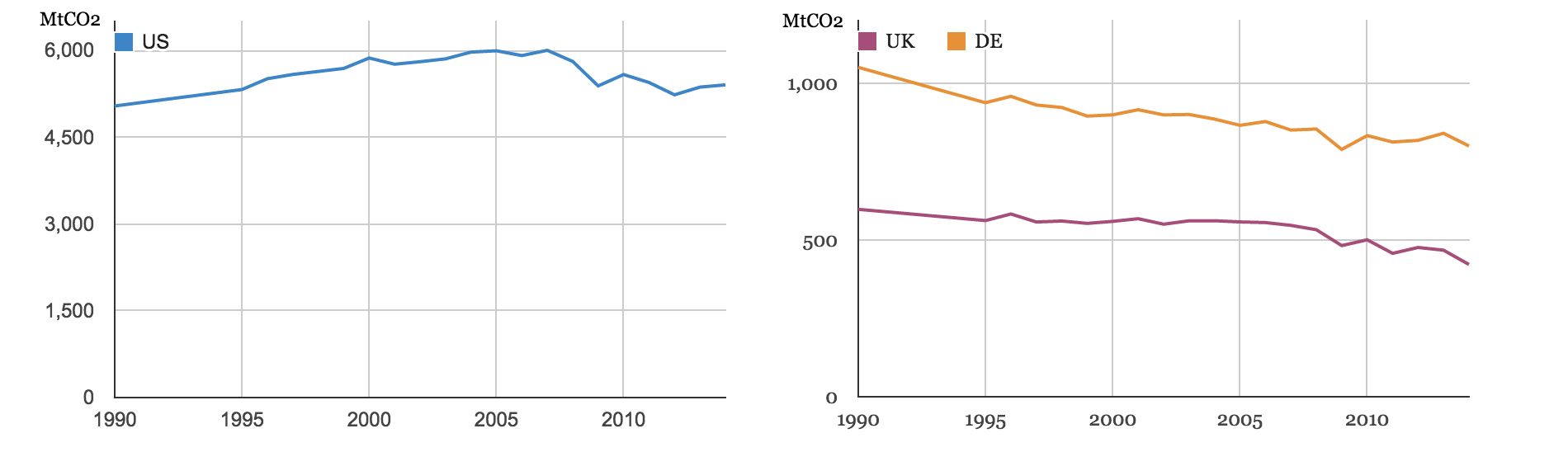
Millions of tonnes of carbon dioxide emitted between 1990 and 2014 by the US, UK and Germany. Note different scales. Source: US Energy Information Administration, UK Department of Energy and Climate Change and German environment agency UBA. Charts by Carbon Brief.
The charts above show that US carbon emissions (blue line, above left) were rising until about 2005, before levelling off and then falling rapidly in part, because of the global financial crisis. Since 2009, US carbon emissions have been effectively constant.
Germany’s emissions (yellow line, above right) fell steeply in the early 90s in the wake of the collapse of communism and then steadily declined until the financial crisis. Since its Energiewende was set out in 2010, German emissions have also been effectively constant.
The path of UK carbon emissions has been steadier, falling in most years since 1990. As for the US, however, emissions have fallen more quickly since the post-financial crisis recession. That looks like round two to the UK as well, but there are yet other ways to measure progress.
It’s worth noting that the two charts above are on different scales: US carbon emissions in 2014 were around 13 times higher than those from the UK and seven times Germany’s. The US population is only five times larger than the UK and four times Germany’s. Each American is emitting a lot more carbon than the average European.
Changing baselines
Another way to look at emissions-cutting records is to see how much things have changed compared to different baselines. The UK and Germany, along with the rest of the EU, use a 1990 baseline to measure climate progress. This is the start date for both nations’ targets to cut emissions by 80% in 2050.
Looking at the charts above it’s perhaps not hard to see why the US makes a different choice, using 2005 as its baseline for international climate pledges. So, let’s line up the three countries using those two baselines to see how things compare.
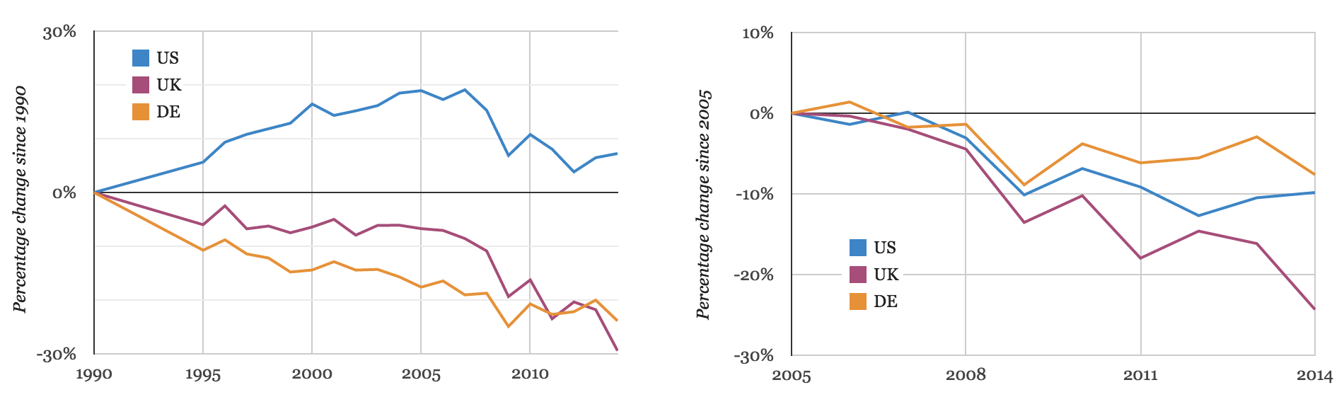
Percentage change in carbon dioxide emissions since 1990 (left) and 2005 (right), in the US, UK and Germany. Source: US Energy Information Administration, UK Department of Energy and Climate Change and German environment agency UBA. Charts by Carbon Brief.
The chart (above left) shows that US carbon emissions in 2014 were around 8% above 1990 levels, having fallen back from a mid-2000s peak. German emissions are 24% below 1990 levels while the UK’s are down nearly 30%.
What about since 2005, the favoured base year for the US? The chart (above right) shows the UK also wins out on carbon reductions in the past decade, down around a quarter against a 10% fall for the US and 8% for Germany.
Absolute and cumulative carbon savings
But, wait, there are two more ways to compare climate efforts. Since the US has a larger population and per capita emissions are higher, too, maybe it has reduced carbon further in absolute terms? These changes are shown in the chart on the left, below.
We might also ask how emissions have added up cumulatively over time, since this is what matters most for the climate. These are shown below right.
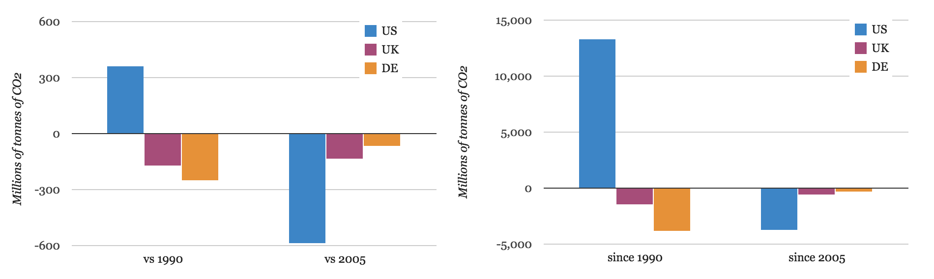
Absolute change in emissions between 2014 and
either 1990 or 2005 (left). Cumulative change compared to
fixing emissions at 1990 or 2005 levels (right). Source: US Energy Information Administration, UK Department of Energy and Climate Change and German environment agency UBA. Charts by Carbon Brief.
US carbon emissions were around 360 million tonnes higher in 2014 than in 1990 (blue chunk, far left) while UK emissions were around 180 million tonnes lower (pink chunk) and Germany’s down 250 million tonnes (yellow).
Since 2005, it’s a different story: it’s US emissions that have fallen furthest, down 600 million tonnes, while the UK’s were around 140 million tonnes down and Germany’s 70 million.
Cumulative emissions, shown above left, matter because the world has a fixed carbon budget. This is the amount that humans can ever emit while retaining a likely chance of limiting warming to 2C above pre-industrial levels.
The US has cumulatively added 13,000 million tonnes of carbon dioxide to the atmosphere since 1990, compared to what would have happened if its emissions had been fixed at 1990 levels (blue chunk, above right). The UK has cumulatively saved 1,400 million tonnes (pink) and Germany 3,900 tonnes (yellow) on the same measure.
You could choose 2005 as the starting point, with the US having cumulatively saved 3,800 million tonnes since then, the UK 600 million tonnes and Germany 300 million. But hailing the carbon saved by the US since 2005, while ignoring what it added before that would fail to acknowledge the cumulative nature of the carbon emissions burden on the atmosphere.
Conclusion
So, what’s behind the changes in emissions these three countries have seen over the past quarter century? Is it their different approach to climate policy, with the UK carbon budgets, Germany’s Energiewende and the USA’s failure to pass climate laws? Would the picture change if we’d looked at China, eastern Europe or Australia?
Are these results down to the US shale revolution, the UK dash for gas, Germany’s turn away from nuclear, or its expensive early backing for renewables? Maybe the largest impacts are down to recessions and structural changes in the economies of each country?
It’s hard to separate out these factors, not least because many of them are interconnected. Moreover, the narratives written around changing emissions shift from year to year.
A couple of years ago US emissions had dropped “because of shale gas”, while the UK and Germany’s were increasing “because of coal”. Now US emissions have risen for two years running while the UK and Germany’s are falling.
One of the few certainties is that the picture will shift again in 2015. The US is expected to see anything from 13 gigawatts of coal capacity to 23 gigawatts retired this year because of air quality rules.
In the UK coal use has fallen to levels last seen during the 1850s industrial revolution, causing a significant part of the large emissions reduction last year. The UK’s three main political party leaders have pledged to phase out unabated coal. Germany, meanwhile, wants to close down its oldest coal plants to avoid missing its 2020 climate targets.
These developments illustrate another certainty: the future of coal in the US, UK and Germany will have a huge impact on how their emissions change this year, and for years to come.
Dr Simon Evans is The Carbon Brief’s Policy Editor, covering climate and energy policy. He holds a PhD in biochemistry from Bristol University and previously studied chemistry at Oxford University. He worked for environment journal The ENDS Report for six years, covering topics including climate science and air pollution.